Growth of mobile has made sure that the importance of responsive web design has increased manifold. If you are a Web Designer or Web Developer looking forward to build responsive websites for your clients and for yourself then look no further. We have compiled some of the very useful tools for building a responsive website.
A responsive websites adapts to every screen size and our collection of these web design tools will not only help you build such sites but also test them. You would also like to check out these responsive CSS frameworks that allow you to build mobile responsive websites.
The tools listed below cover almost every aspect of responsive design site such as responsive text, responsive images, responsive videos, responsive sliders, responsive menus and much more. If you are a web design agency then you may want to bookmark this page to keep these tools handy.
Free Responsive Web Design Tools
1. Am I Responsive?
![am-i-responsive[1]](https://superdevresources.com/wp-content/uploads/2015/04/am-i-responsive1.png)
Show off how responsive design looks across different browsers easily with this 4 in 1 viewport tool. See how your site looks on desktop, laptop, iPad & iPhone. This is not a tool for testing, it is really important that you do that on real devices. This instead is a tool for quick screenshots and to visually allow people to “get” what you mean in client meetings.
Do note that this tools require cross-browser option to be enabled on websites to work. If this doesn’t work with your website that you are recommended to use one of the plugins listed later on this list.
2. FitText
![fittextjs[1]](https://superdevresources.com/wp-content/uploads/2015/04/fittextjs1-768x378.png)
FitText is a jQuery plugin for inflating web type. It makes font-sizes flexible. Use this plugin on your fluid or responsive layout to achieve scalable headlines that fill the width of a parent element.
3. FitVid.js
FitVid.js is a lightweight, easy-to-use jQuery plugin for fluid width video embeds. FitVids automates the Intrinsic Ratio Method by Thierry Koblentz to achieve fluid width videos in your responsive web design.
4. Slideout.js
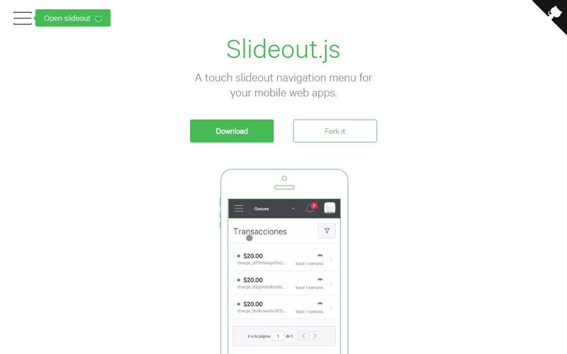
Slideout.js is a touch based slide-out navigation menu suitable for your mobile web apps and mobile responsive websites. It is a dependency free JavaScript library that has small footprint and support native scrolling. It can be easily customized and can be used with CSS transformations and transitions for animating the slide-out.
5. Glide.js
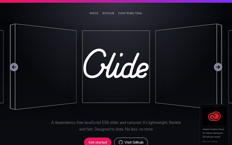
Glide.js is a dependency-free JavaScript ES6 slider and carousel. It’s both lightweight and supports mobile devices. It can be used to build touch responsive sliders for mobile as well for desktop. You can easily theme this library or extend it as per your use case.
6. JQuery lightSlider
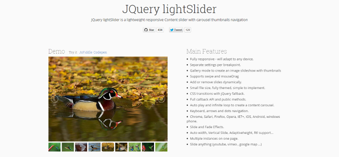
jQuery light Slider is a lightweight responsive Content slider with carousel thumbnails navigation. It supports swipe and mouseDrag and can be used to slide anything: images, YouTube, Vimeo , Google maps, etc.
7. Responsive Elements
![responsiveelements[1]](https://superdevresources.com/wp-content/uploads/2015/04/responsiveelements1.jpg)
Responsive elements makes it possible for any element to adapt and respond to the area they occupy. It’s a tiny JavaScript library that you can drop into your projects today.
8. Dense.js
![dense[1]](https://superdevresources.com/wp-content/uploads/2015/04/dense1.jpg)
Dense is a jQuery plugin that offers an easy way to serve device pixel ratio aware images, bringing in retina support to your website. Clear the blurry, images be crisp.
9. Browser Resolution Tester
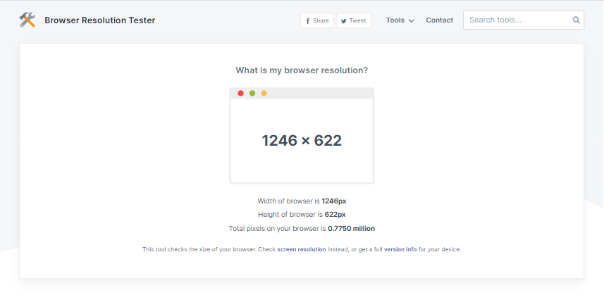
This tool allows you to check browser resolution to know width and height (in pixels) of the web browser you are using. This comes in handy when you want to know the browser size of your client that may be having trouble accessing your website. You may also want to use their version checker to get a full report of your clients PC configuration and browser specs in order to debug the issue they may be having on their system.
10. Screen Resolution Tester
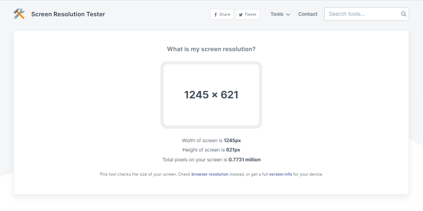
This tool will check full screen resolution to know width and height (in pixels) of the screen on the device where this tool was run. It will come in handy to know the exact screen size that your client may be using when accessing your website.
11. Responsible.js
![responsible[1]](https://superdevresources.com/wp-content/uploads/2015/04/responsible1.jpg)
Responsible.js gives visitors the choice of what mobile experience they want. Adds Toggle for mobile to desktop switching without page reloads.
12. Responsive Viewer
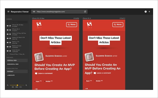
Responsive Viewer is a chrome plugin that allows you to show multiple screens once which comes in handy when doing responsive design testing. The tool is capable of doing sync scrolling so that you can browser through your website in multiple devices of different size at once.
13. Viewport Resizer
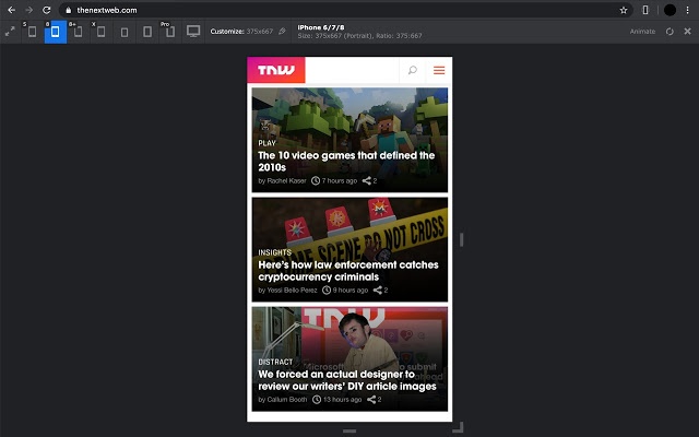
Viewport resizer is another chrome plugin that is capable of emulating various screen resolutions. You can easily switch through different device type and share your defined environment of devices and breakpoints directly with your team and client.
14. CSS Peeper
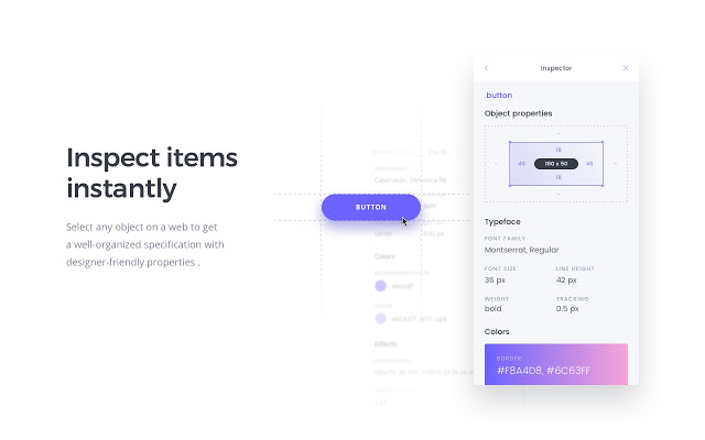
CSS Peeper is a chrome plugin that allows you to inspect the styles of websites without looking at the code. This comes in handy when you want to inspect the font-size, width, height etc. of a website element quickly.
15. Amino: Live CSS Editor
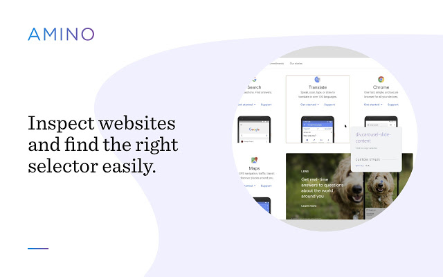
Amino CSS editor allows you to inspect and edit CSS of any website and see the result in real time. This is handy when you want to optimize your website on different screen size directly inside the browser for different configurations. You can also use their inspect tool to scan pages and find selectors that you want to customize with CSS. Exporting the edited CSS is also supported.
Suggest Responsive Web Design Tools
Know of great free responsive web design tools that we may have missed? Why not leave a comment about them and how it makes your life as a web designer easier.
Here are a few handy list of responsive templates that will help you get started with a mobile friendly site:
- Best Coming Soon Templates
- Best Job Portal Templates
- Best Photography Website Templates
- Best Material Design Templates
- Best Resume Website Templates
We also have great collection of free responsive WordPress themes and Tumblr themes, so do check them out too.