Pulse Animation CSS with Heart, Ring and Circle
Let's create pulse animation effect with CSS on Heart, Ring and Circle. A pulsating animation effect can be easily created with CSS. Below you can see the CodePen demo of the animations I created.
See the Pen Pulse effects on Ring, Circle and Heart by Kanishk Kunal (@kanishkkunal) on CodePen.
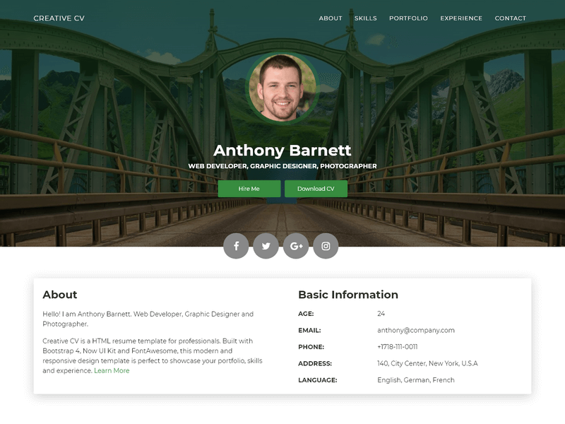
We have used this same effect in our template Creative CV. The pulse animation has been used for highlighting the profile picture in the header section. It gives a nice attractive effect to profile photos.
HTML Code
The HTML code for this demo is quite simple and consists of multiple div for creating the base shape. You can also embed an image inside these div and style them appropriately.
Classes .pulse-base, .pulse-circle and heart are used to add the CSS animation.
<div class="panel">
  <div class="col">
    <div class="pulse-base"></div>
  </div>
  <div class="col">
    <div class="pulse-base pulse-circle"></div>
  </div>
  <div class="col">
    <div class="heart">❤</div>
  </div>
</div>
CSS Code
The CSS code describes @keyframes for pulasting animations. We create the normal pulsate effect and also the heart-pulse which emulates a heart beating animation with CSS.
Individual classes .pulse-base, .pulse-circle and heart then use these animation with animation-iteration-count of infinite. Take a look at the CSS below.
@keyframes pulsate {
  0% {
    transform: scale(0.6, 0.6);
    opacity: 0;
  }
  50% {
    opacity: 1;
  }
  100% {
    transform: scale(1, 1);
    opacity: 0;
  }
}

@keyframes heart-pulse {
  0% {
    transform: scale(0.75, 0.75);
  }
  30% {
    transform: scale(1, 1);
  }
}

.pulse-base {
  position: relative;
  height: 60px;
  width: 60px;
  border: 15px solid #222;
  border-radius: 50%;
  margin: 0 auto;
}

.pulse-circle {
  background: #86cfda;
}

.pulse-base:before {
  content: '';
  border: 15px solid rgba(255, 255, 255, 0.3);
  border-radius: 50%;
  height: 60px;
  width: 60px;
  position: absolute;
  left: -15px;
  bottom: -15px;
  animation: pulsate 1.6s ease-out;
  animation-iteration-count: infinite;
  opacity: 0;
  z-index: 99;
}

.heart {
  font-size: 90px;
  line-height: 1;
  color: red;
  margin: 0 auto;
  padding: 0;
  animation: heart-pulse 0.8s ease-out alternate;
  animation-iteration-count: infinite;
}
Pulse Animation in Use
You can find that we used pulse animation in our template Creative CV. The pulse animation adds effect to the profile picture in the header section. Check out the demo and download the template to see it in action.
If you liked the above template, you can find more such resume website templates offered by us. You can also take a look at these HTML resume templates for more options.
